Enterprise · DAM
Atlas — a scalable Digital Asset Management system
Marketing teams at large enterprises were drowning in assets — versions, rights, project links and onboarding all lived in separate places. The legacy DAM was data-dense but unusable at scale.
- Role
- UX Lead
- Duration
- 12 months
- Company
- Enterprise (NDA)
- Domain
- Enterprise SaaS · Marketing Ops · DAM
01
The problem
Marketing teams at large enterprises were drowning in assets — versions, rights, project links and onboarding all lived in separate places. The legacy DAM was data-dense but unusable at scale.
02
The approach
Design a DAM that streamlines asset onboarding, enhances security, and simplifies version control, copyright management and project linking — scalable, easy to integrate, and built for collaboration.
02.01
Pitfall map — where the experience broke down
Pitfall analysis was conducted with 6 users across distinct personas representing different roles in the asset lifecycle. Heatmaps captured interaction intensity — from least-observed to highly-observed areas — revealing where users hesitated, scanned, or abandoned tasks.
Task-flow testing with prospective users revealed critical breakdowns in discoverability, clarity, and system behavior. Each pitfall summarises where users struggled, why, the business risk, and the design fix.
Pitfall
Bulk actions not discoverable
- Where
- Users couldn't locate bulk actions while managing large asset sets.
- Why
- Placement varied across modules, breaking mental models.
- Business risk
- Slower campaign workflows; repeated attempts increased friction.
- Design factors
- No unified action-bar pattern; inconsistent decisions; mobile controls collapsed.
- Recommendation
- Standardize action placement with fixed location, icon + label, and responsive behavior.
Pitfall
Metadata forms overwhelmed users
- Where
- Users hesitated or skipped fields during tagging.
- Why
- All fields appeared at once with no hierarchy.
- Business risk
- Incorrect tagging → poor searchability → delays and rework.
- Design factors
- No metadata hierarchy; unclear mandatory fields; no progressive disclosure.
- Recommendation
- Introduce tiered metadata with clear required fields and progressive disclosure.
Pitfall
Role-based access not clear
- Where
- Users attempted actions they didn't have permissions for.
- Why
- No visual cues for access levels or disabled states.
- Business risk
- Support tickets increased; users assumed system failures; collaboration slowed.
- Design factors
- No permission-aware UI states; inconsistent visibility rules.
- Recommendation
- Add disabled states, tooltips, and contextual messaging for permissions.
Pitfall
Mobile responsiveness broke tasks
- Where
- On-the-go users couldn't complete essential tasks on mobile.
- Why
- Controls collapsed unpredictably; key actions moved below the fold.
- Business risk
- Task abandonment → reduced adoption → inconsistent governance.
- Design factors
- No defined breakpoints; desktop-first decisions; inconsistent scaling.
- Recommendation
- Define responsive breakpoints and adopt mobile-first layout rules.
Pitfall
Collaboration broke across locations
- Where
- Teams couldn't track asset status or ownership clearly.
- Why
- Asset states were subtle, inconsistent, and easy to miss.
- Business risk
- Wrong assets used in campaigns; compliance issues; reduced trust.
- Design factors
- No unified asset-state pattern; inconsistent colors/labels.
- Recommendation
- Standardize asset states with consistent colors, labels, and transitions.
02.02
Design implementation
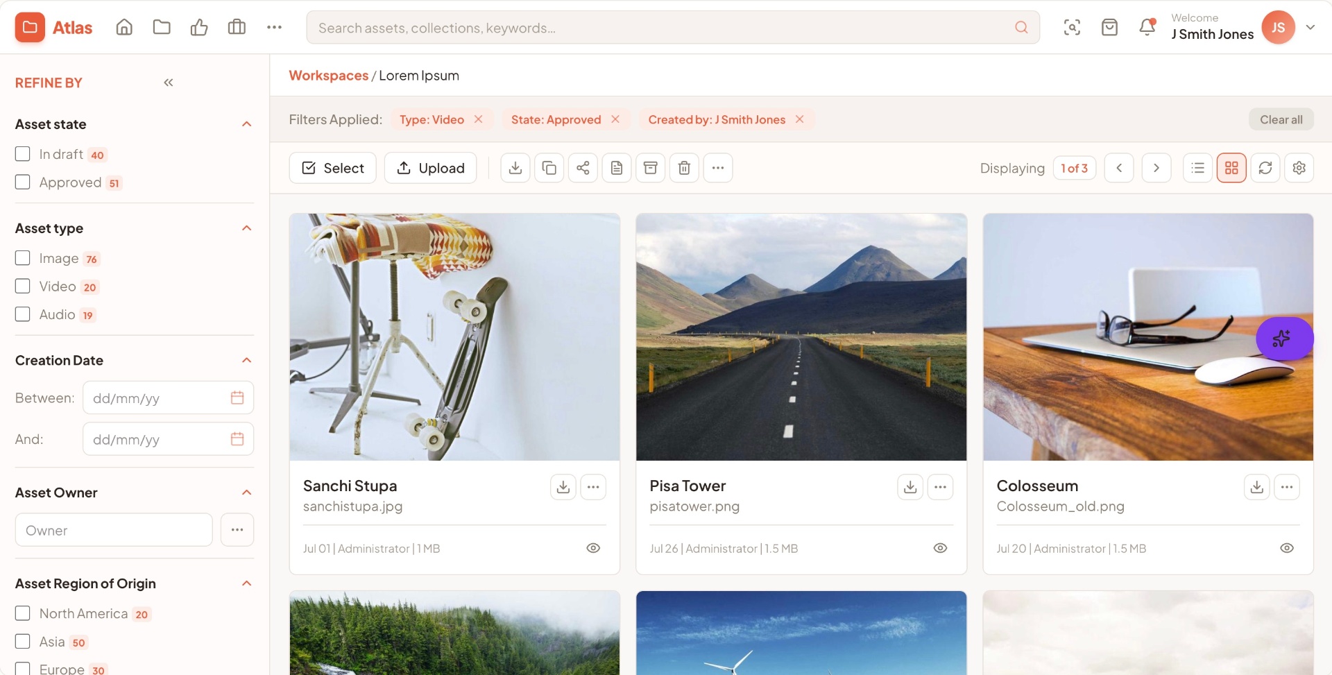
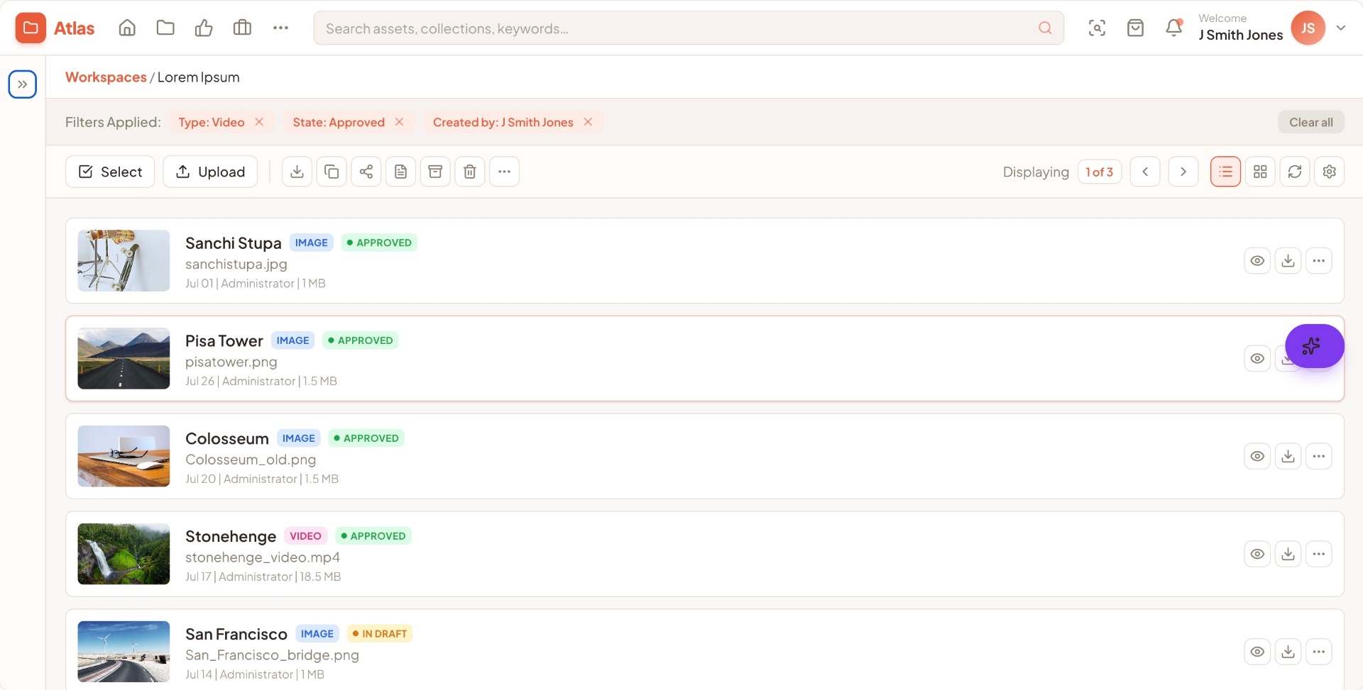
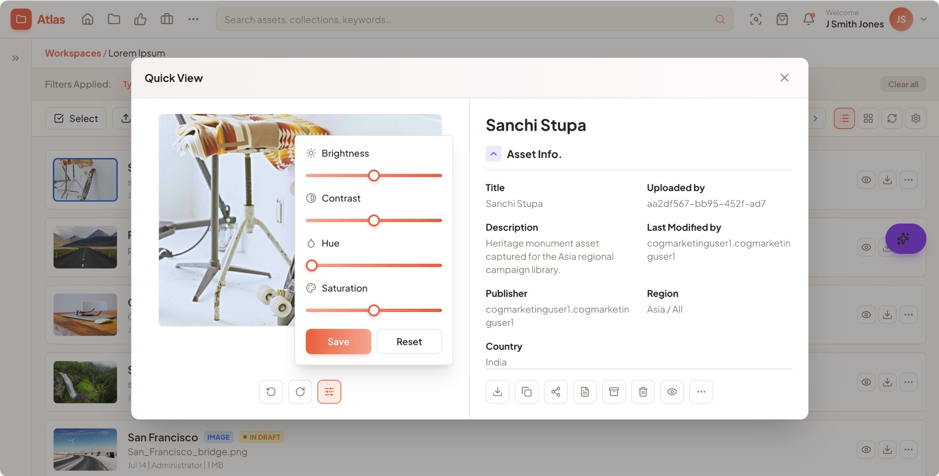
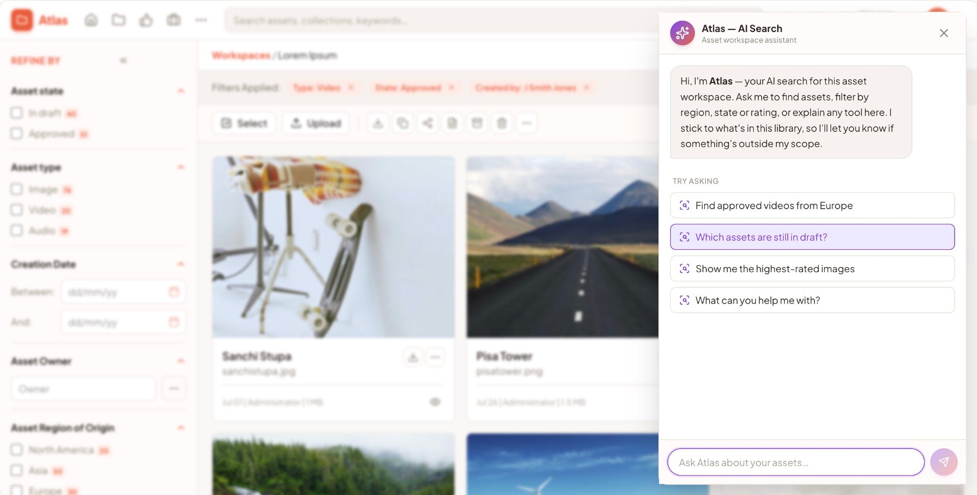
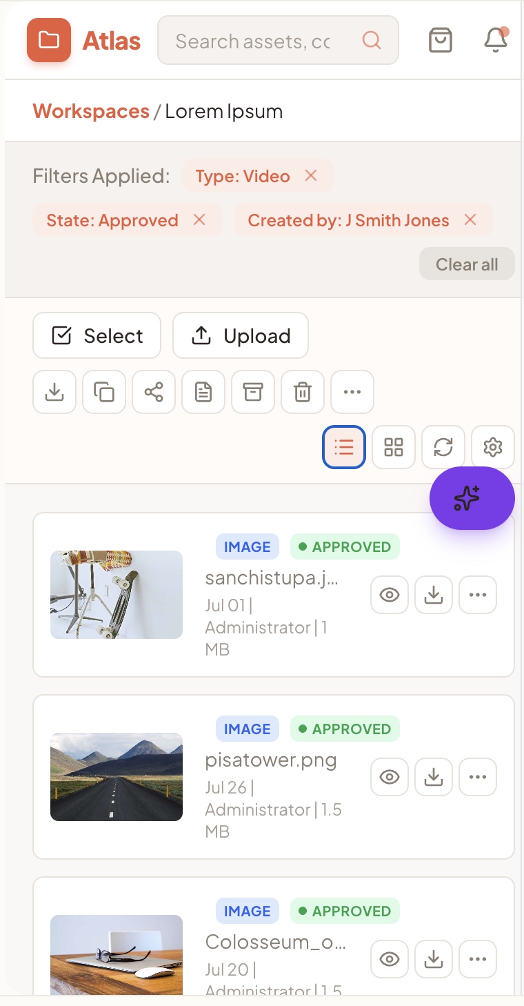
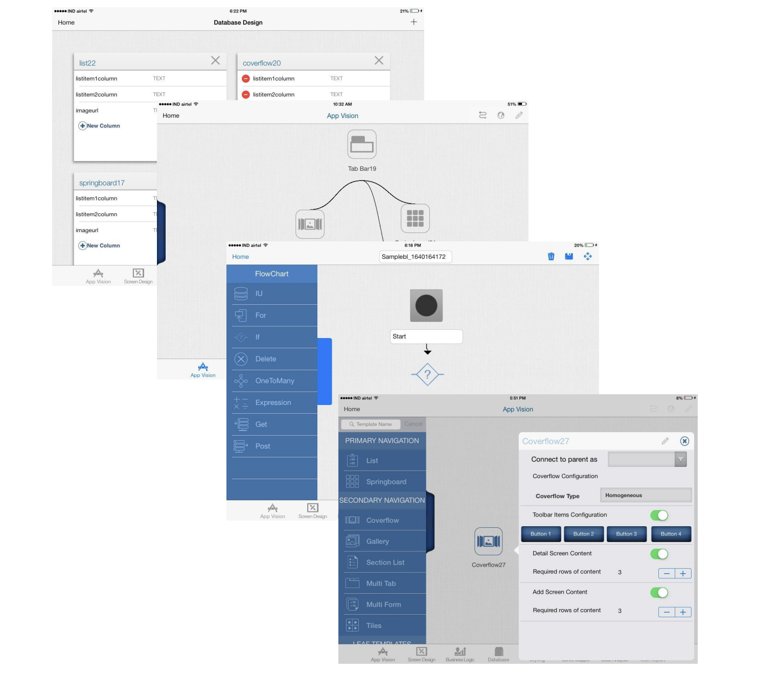
Reframed the product around search-first interaction. Filters, facets and a structured result layout became the primary surface, with admin and ingestion flowing behind it.
02.03
Balancing depth and clarity
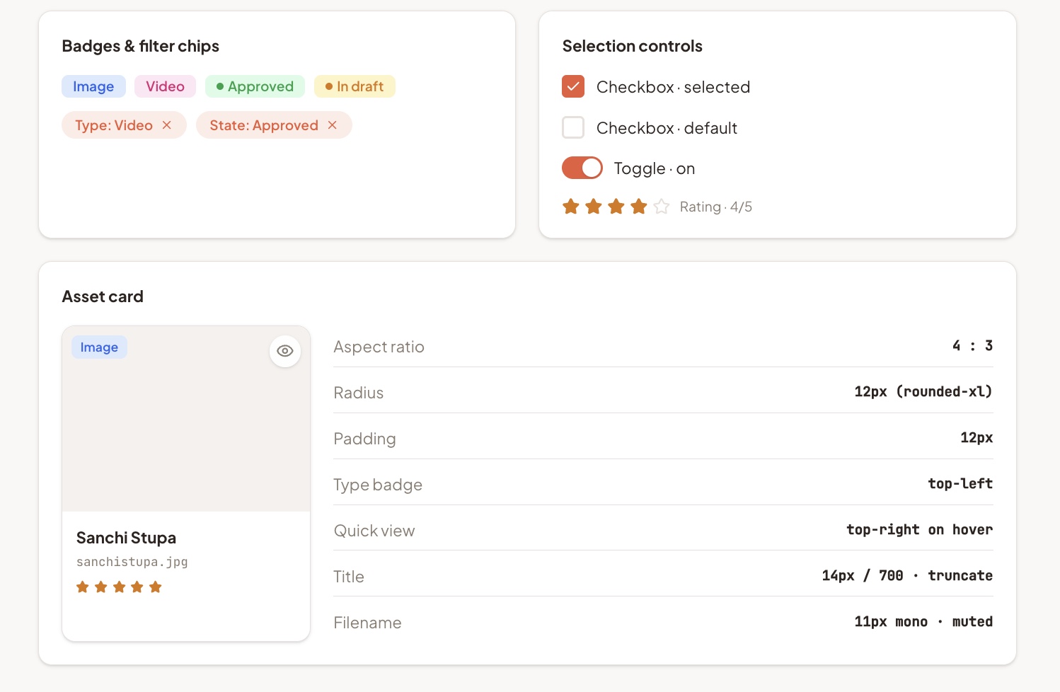
Introduced a clean, structured layout for operational data. Subtle grid lines and measured padding separate dense information so users can scan large datasets without fatigue.
02.04
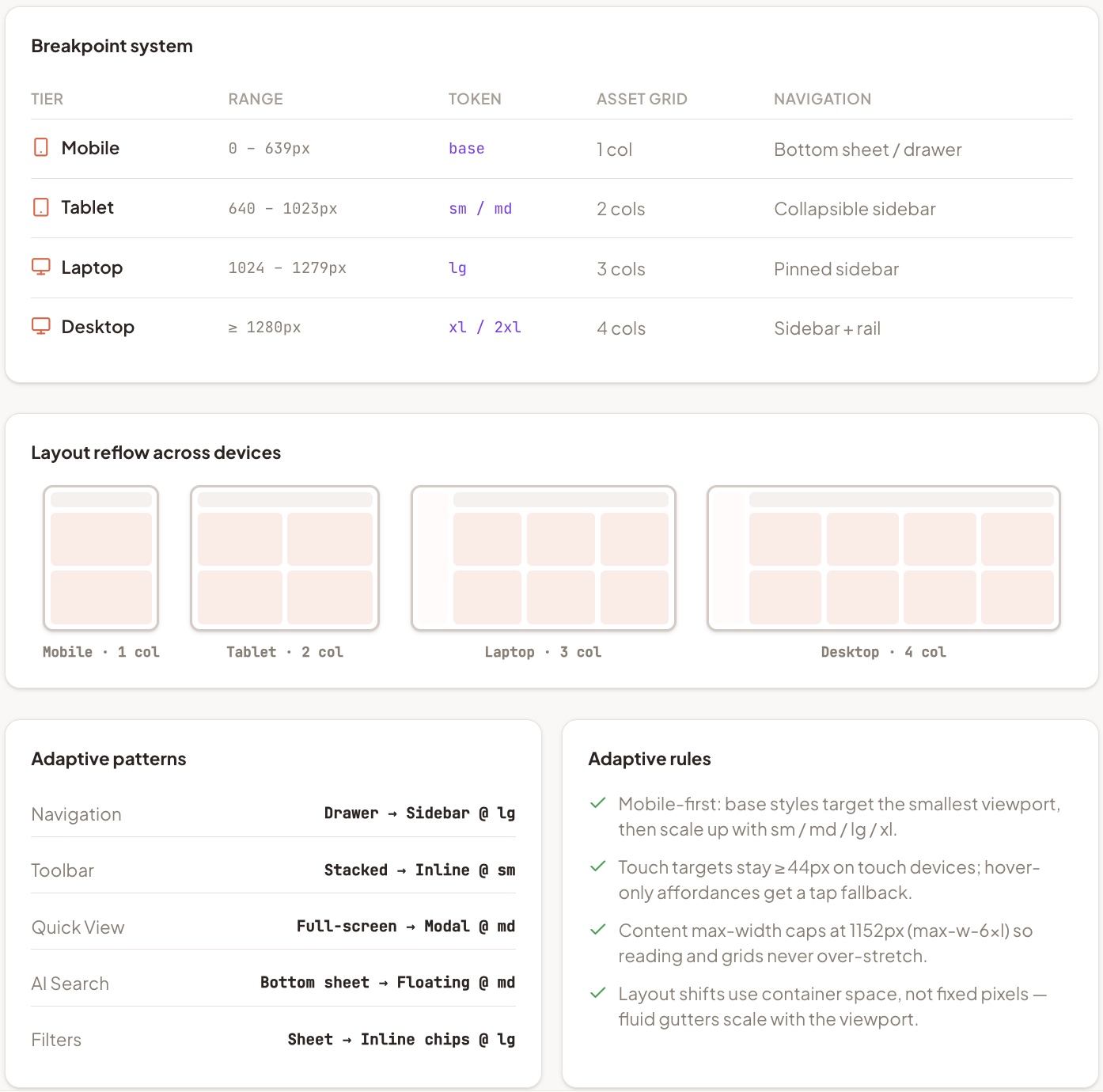
Adaptive design
Built adaptive layouts tailored to each device's capabilities and context — not just responsive scaling. Menus, sidebars and nav re-organise based on screen size and use context.
02.05
What success looks like — a scalable foundation that endures
Research
Designing for a fast-evolving enterprise product meant thinking beyond individual screens — it required protecting the integrity of the system, ensuring patterns stayed consistent, and building an experience that could scale across teams, devices and future feature rollouts.
By grounding the product in clear interaction models and predictable patterns, we created a foundation that teams could build on without eroding usability. Its longevity speaks to the strength of its underlying UX architecture — scalable, stable, and intuitive enough for users to carry their learned patterns forward as the product grows.
03
The outcomes guiding project road map
- In dense enterprise tools, search-first beats nav-first — filters and facets do more work than menus.
- Adaptive layouts (not just responsive scaling) are what keep mobile tasks completable in the field.
- A consistent component and state system is the real moat — it's what lets the product scale without re-onboarding users.
04
Selected screens
Keep reading
Other case studies
Working on a similar problem?
I take on senior contract, fractional and select full-time engagements where the brief is unclear and the stakes are real.
anjani.vc@gmail.com