
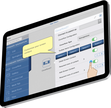
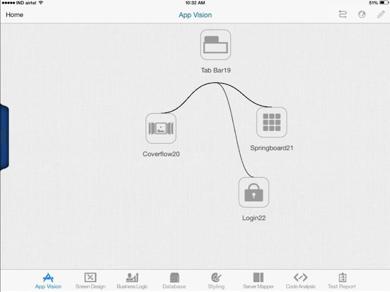
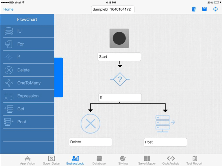
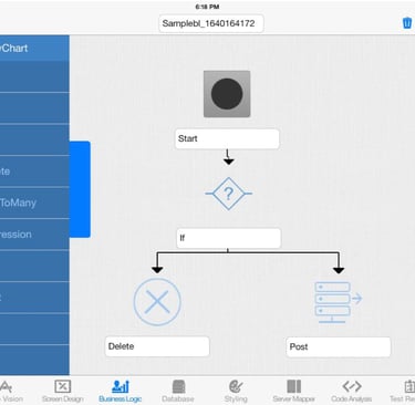
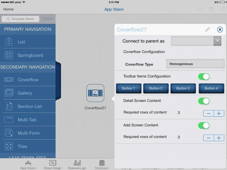
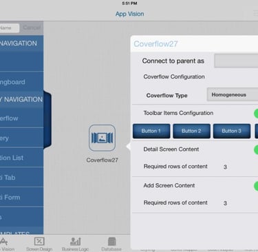
Our "No Code" app builder is called One Mobile Studio
Mobile Center of Excellence is trying to streamline the mobile app development process by reducing costs and complexity. Looking for a suite of tools that empower developers to rapidly create high-quality native applications for Android and iOS devices. Focus on efficiency and innovation.
About Project
Role : User Experience Designer
Duration : 1 year
Year : 2014
Company : Cognizant Mobile Center of Excellence

Project Scope
Mobile Application Development Platform (MADP) that can reduce the cost and complexity of mobile app development. This platform emphasizes reusability of screen designs, enabling faster development cycles and improved efficiency for developers across Android and iOS environments.
Product vision
Faster
Cut down on project timelines. For projects that need a faster development of apps with little very little need for customization.
Cheaper
Projects working with very limited human resources. Projects that require working with less resources for development.
Better
Projects Working with Developers who are new to Mobile technologies. For those who are newly venturing into developing for Mobile
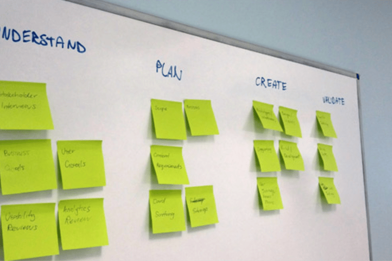
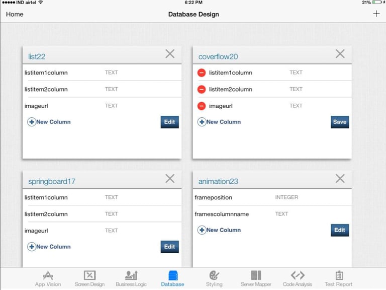
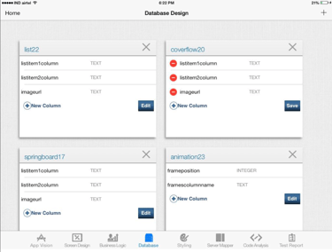
Design Process
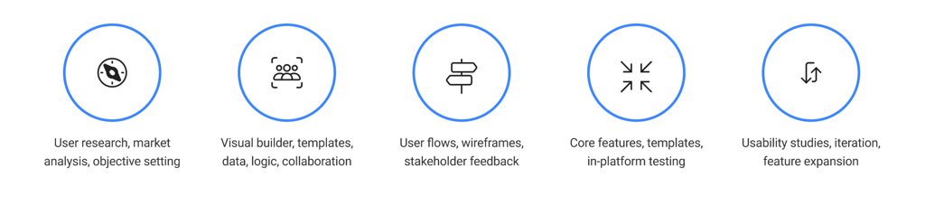
Market Research Benchmarking Screen layouts
Market researching and proposal of most frequently used screen layouts for mobile and tablet devices, interaction models, and components that fill the layouts. While creating reusable assets its important to standardize a format to make sure you are addressing a varied set of users needs and give a sense of flexibility while also adhering to the standards set by Operating systems
200+
10+
Templates genaralized
Screen layouts studied
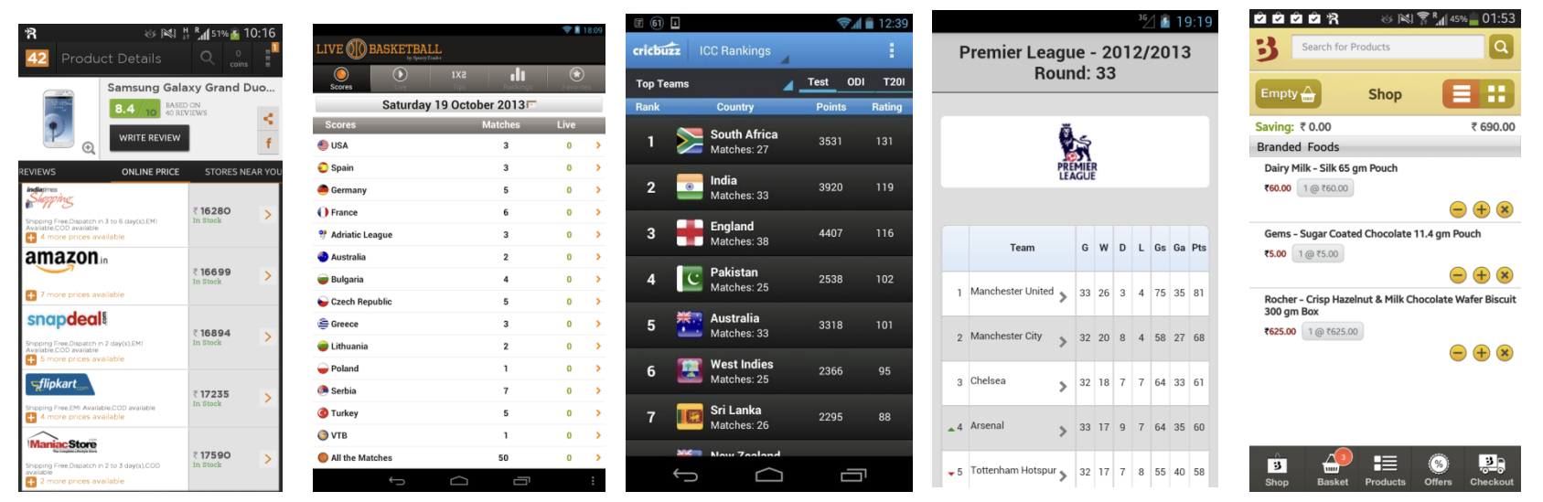
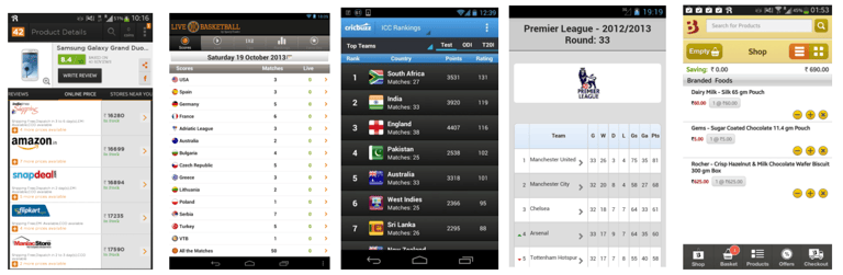
Below image showing various "Table" styles studied in the year 2013 to understand market usage to benchmark the template.
Proposal to standardize a format

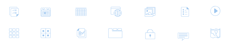
Iconography for the final templates
With reusable assets its important to standardize a format to make sure a varied set of user needs are addressed. Provide a sense of flexibility while also adhering to the standards set by Android and iOS providers that are in scope for our tool.
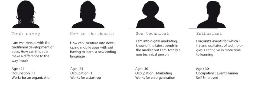
User Study
Here are our key user archetypes, each with distinct goals, backgrounds, and behaviours. Our target audience are Mobile app developers , New to mobile app dev domain, Non technical users- sales etc., Enthusiast.
Here is where we started our User Research
What might the users mental model be while using a "No code" app builder ?
Designing customer journey for the app is more complex due to more channels and customer touch points users can interact with.
Mapping Task Flows Around User Goals
Customer Journey - Understanding Complexity
Visual hierarchy: Determine if the design effectively guides users to the most important elements.
Consistency : Use of a design system consistently throughout the application
Prototypes evaluation using Heuristic : User control and freedom, consistency, error prevention, and help/documentation
Design principles followed
Navigational clues : cues that help users find their way through an interface.

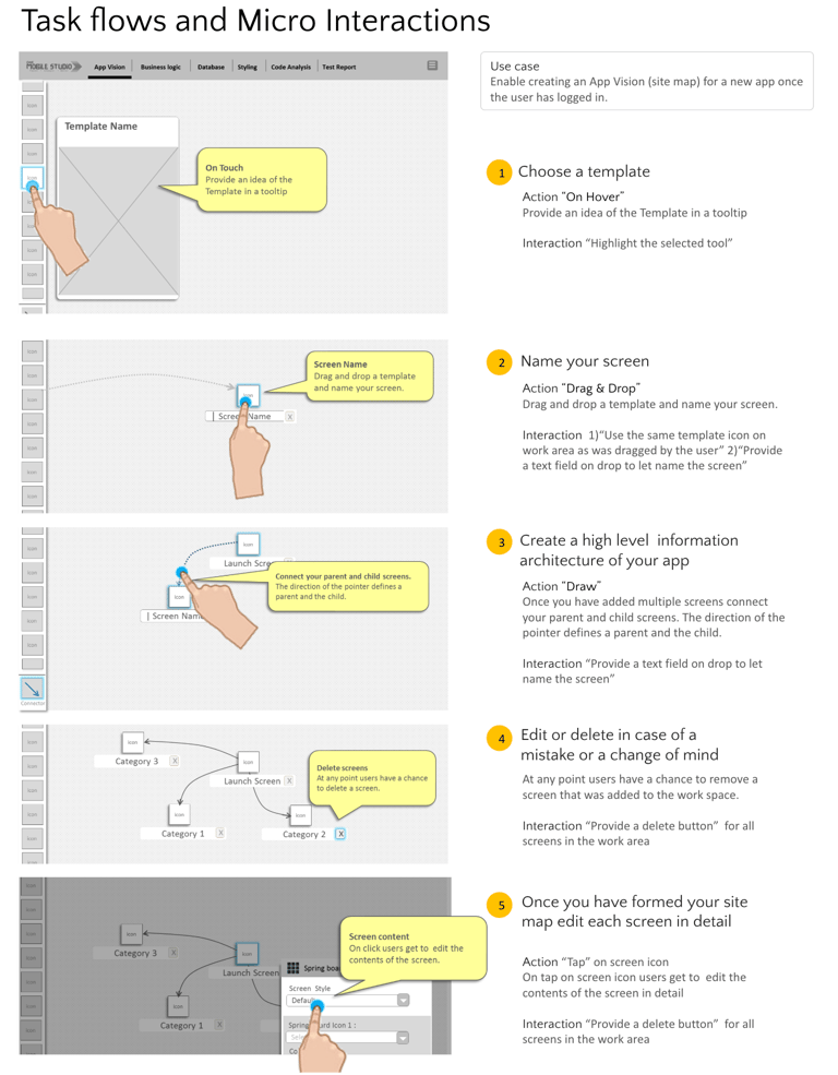
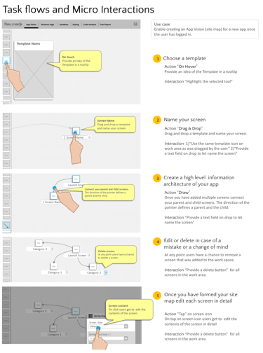
Providing users with immediate and clear responses to their actions and enabling users to refine and easily acomplish their task.
Designing Feedback Loops - micro interactions
Behavioural Research
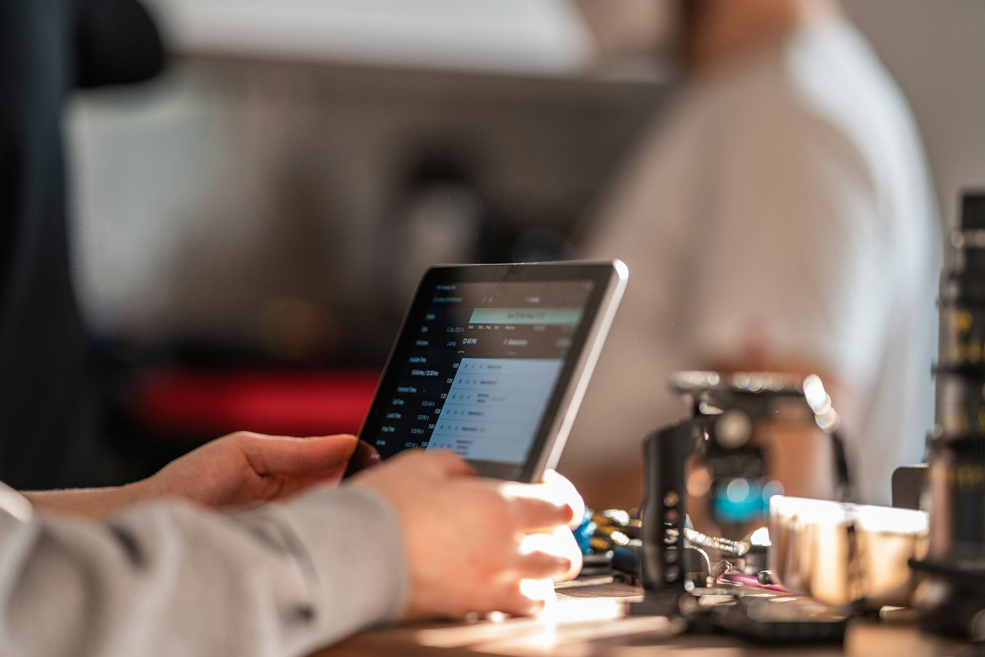
Once our product is in a performing state we conducted an in-house hackathon to study user behaviour in a dynamic, collaborative setting. This format allowed us to observe participants’ problem-solving, teamwork, decision-making, and creativity under time pressure.
Background image credits : Photo by Leon Seibert on Unsplash
Behavioural Research
Methods used for Testing
Think-Aloud Protocol:
Using the think-aloud protocol allowed us to gain direct insights into users’ cognitive processes, expectations, and frustrations as they interact with the no-code app builder. Uncovering - Usability issues, Understanding users’ mental models, and identifying areas where the interface may not align with user expectations.
Screen Recording:
Screen recordings to provide a detailed, visual account of every user action—clicks, scrolls, hesitations, and navigation paths. Pinpoint moments of confusion, track user flows, and identify specific pain points or friction in the interface. The combination of screen recordings with think-aloud commentary offered a holistic view of both what users do and why they do it.
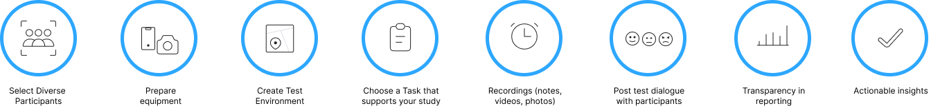
Test Environment Details
In-house Hackathon
Platform: iOS , Android
Device : iPad , Nexus
Year: 2014
Methodology: Think-aloud protocol and screen recording
Recordings : On device screen recorder and in-person observer to take note of users thinking aloud
Limitations:
Mental model information is inferred from the behaviour of subjects performing tasks in test environments. So new behaviours may be encountered in actual work environment.
UX Test Environment and Methodology used
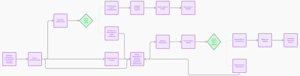
Synthesize findings from think-aloud data and screen recordings to produce actionable insights
Task Description for Participants:
Imagine you are building a simple restaurant menu app for a local eatery. The app should allow users to:
View different categories of menu items (e.g., Starters, Main Course, Desserts, Drinks)
See details for each menu item (name, description, price, and an image)
Add menu items to a favorites list or order list (optional)
Navigate smoothly between categories and item details
4+
Participants who are familiar with the app
Participants who are newly introduced to the app
10+
What Worked ?
Call-to-action buttons like "Link," "Publish," "Save" stood out and drew user attention.
Sidebars and toolbars were key hotspots.
Visual cues (color, animation, tooltips) helped users find important features.
Onboarding flows that highlighted hotspots boosted early engagement.
Forgiving interfaces (undo, auto-save) encouraged experimentation without fear.
Areas that need Improvement
Users only superficially explored data logic and database features.
Paper based planning helped some of the hackathon groups complete tasks faster than those who directly started with the tool.
Critical but underused features needed the platform to provide assistance with learnings
Support is missing for complex tasks setup.
Screen templates needed more generic naming as few template naming were misleading or didn't match user expectation.
UX Research Takeaways
Most 1st time users struggled beyond basics like adding screens, styling and naming data tables.
Tech users those already experienced with the tool struggled with alignment of UI components. The grid structure was too daunting.
Users underestimated the complexity of business logic and database integration.
Logical and physical data models, and integration can be intimidating for beginners.
Onboarding and tutorials should bridge simple UI tasks and complex workflows.
Gradually introducing features helps users build confidence.
UX improvements - Real-time guidance (tooltips, examples) to reduce confusion.
UX improvements - Hotspots must lead users to meaningful, high-value actions.
Bite-sized learning (short videos, demos) helps users learn without overwhelm.
Continuous testing and iteration smooth out friction points.
To invest in developing materials for learning
From insights to concrete actions
Introducing users to the understanding that app development involves not just Screens, but also needs an understanding how data moves.
Build confidence and competence step by step Systematically introduce users to data integration fundamentals, design, development, and management, helping them
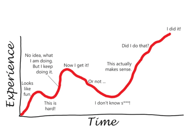
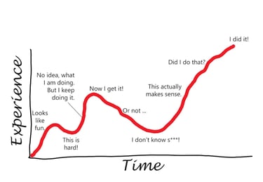
Credits : A reference image from medium post by Stephanie De Smedt
Address the learning curve
The Design Team
User Experience Designer, User Researcher, Usability Evaluator and Researcher.
Project Duration : 1 year
Visual Designer, Visual design Strategist.
Project Duration :1.5 Years
Design Market Researcher, Benchmarking templates.
Project Duration : 4 months


Anjani Varma
Sagar Irukula
Vikas Kumar
Associate of the year
Project Delivery Excellence
Cognizant C&Ds 2014