
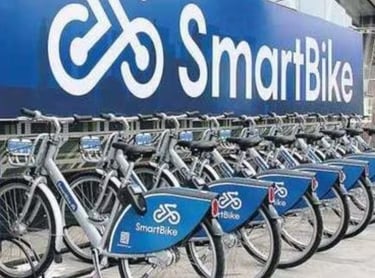
SmartBike
Revamping Admin portal
Designing a Scalable, Efficient Operations UI
As a UX designer working closely with Smartbike’s operations stakeholders, I had the unique opportunity to reimagine their legacy admin system-one that was struggling to keep pace with the rapid expansion across multiple cities and the complexity of varying traffic patterns.
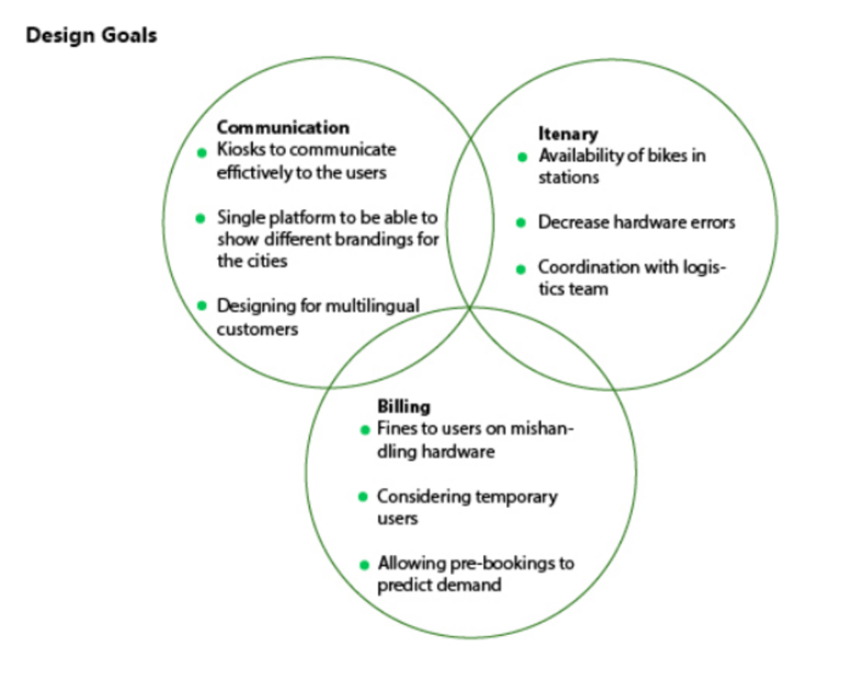
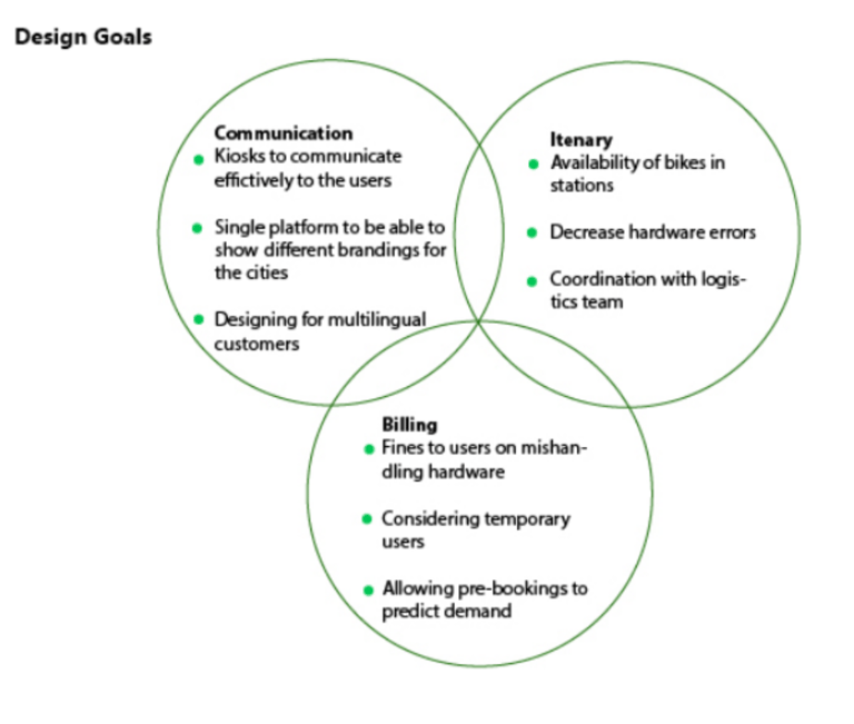
Understanding the Challenge
The legacy system was dense, cluttered, and difficult to navigate-making it hard for ops teams to quickly assess bike statuses, manage fleet distribution, and respond to real-time issues. With Smartbike scaling rapidly, the need for a streamlined, intuitive interface became critical. Our goal was clear: build a system that supports fast, confident decision-making without overwhelming the user.
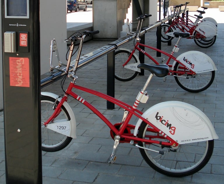
Public Bike Sharing Administration
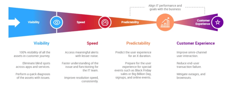
This Information Visualization is adapted from - https://netenrich.com/blog/it-modernization-and-digital-experience
Role : UX Designer
Year : 2015
Project Duration : 6 Months
Company : Cognizant
About Project
Bridging Real-World Complexities with Digital Precision
During user interviews with Smartbike admins from cities like Barcelona, New Mexico, and cities of Italy, it became clear that the legacy system failed to capture the real-world complexities they encountered daily-such as trees blocking docking slots where not every lock was usable or held a bike.
The old system treated all locks equally, assuming a full station meant all slots were occupied, which led to inaccuracies and time-consuming manual workarounds. These insights fundamentally shaped the redesign, resulting in a new Smartbike dashboard that accurately distinguishes between locks that are closed but empty and those with bikes docked, adapts to each city’s unique environment, flags anomalies, and bridges the gap between physical infrastructure and digital tracking. This user-centered approach underscored the importance of designing systems that reflect real-world complexity, ensuring the product truly supports the people managing and maintaining the bike-sharing network every day.

How User Research Saved the Day
20+
Stakeholder Interviews
4
Number of cities for implimentation
Admin Portal Design
1
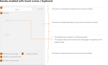
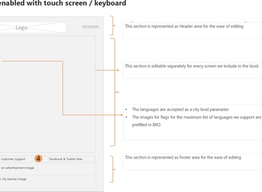
Kiosk interaction Design
1
As a part of the project 60+ screens were designed in a very tight schedule. Tight schedules challenged us in negotiating for stakeholder interviews.
Our end-users stations admin always had a busy work day so fitting in time for user interviews was hard. Some times we were able to get a buy in for stakeholder interviews only after the initial screens were presented as a demo to the end users (Station admin). After which they could understand where these questions are coming from and why addressing them are crucial for designing an improved system.
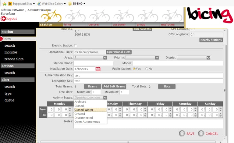
Legacy system
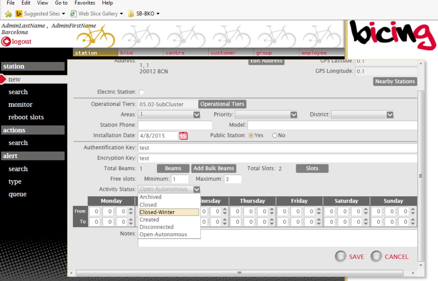
Balancing Depth and Clarity
We tackled the challenge of presenting heavy operational data by introducing a clean, structured layout. Subtle grid lines and carefully measured padding help separate dense information, making it easier for users to scan large datasets without fatigue.
Scaling for Multiple Cities and Traffic Patterns
Allowing ops teams to toggle between cities with tailored data and controls.One of the biggest challenges was designing a system that could adapt as Smartbike expanded into new cities with unique traffic flows
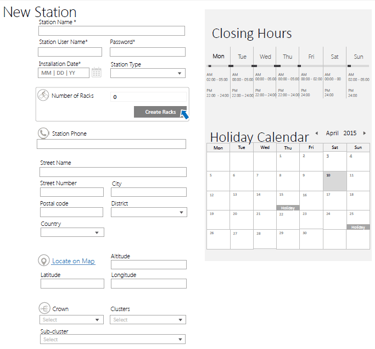
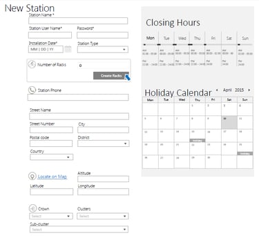
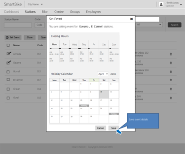
Admin portal


List of screens
As a part of the project 60+ screens were designed in a very tight schedule.
Functional Dashboard
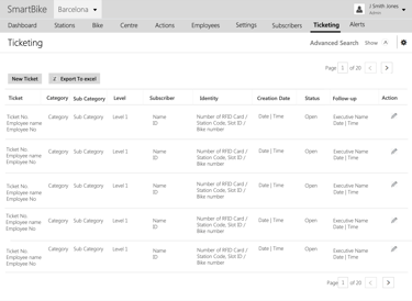
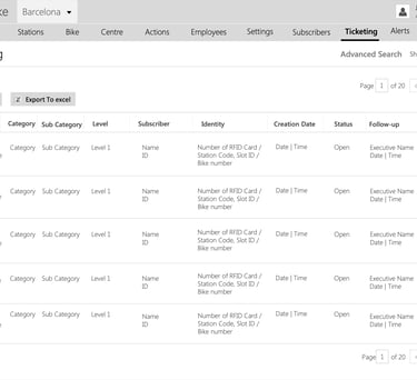
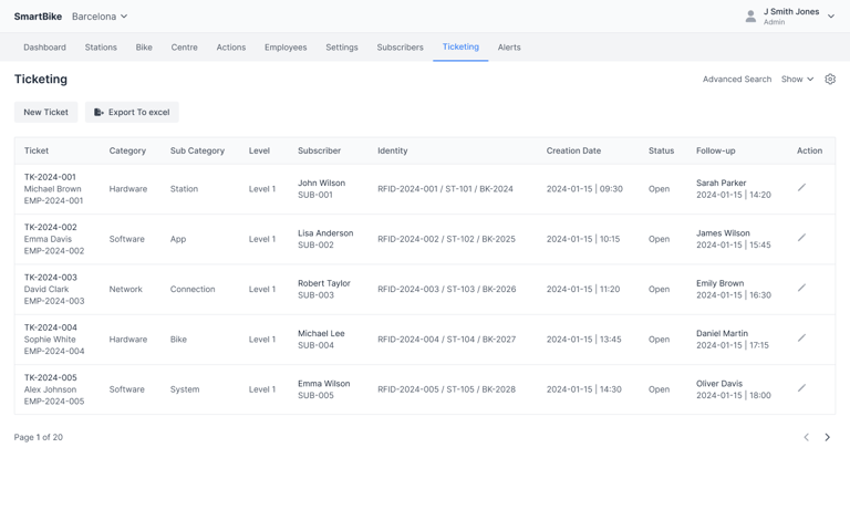
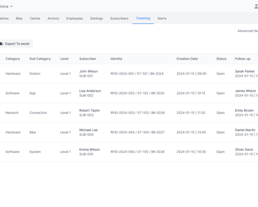
Ticketing Workflows
Alerts workflows
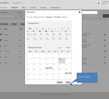
Station Calendar workflows
Centers (Cities) work flows
Audit workflows
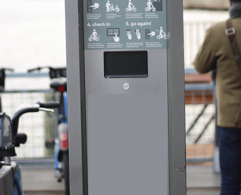
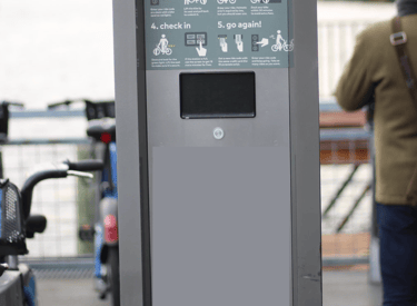
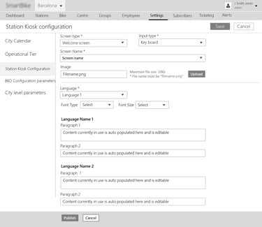
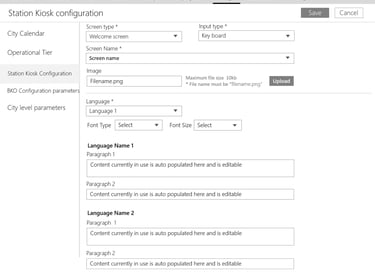
Configuring kiosk screens workflows
Key takeaways as a Designer
Trust is built through active listening, transparency, and proof of concept.
Working on this project I had an excellent experience and exposure . As a designer transformed skepticism into advocacy.